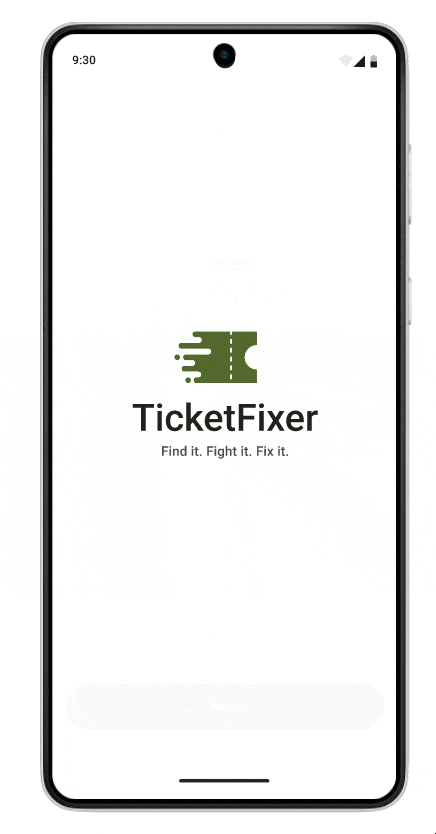
TicketFixer
Parking Fine Payment and Dispute Mobile App

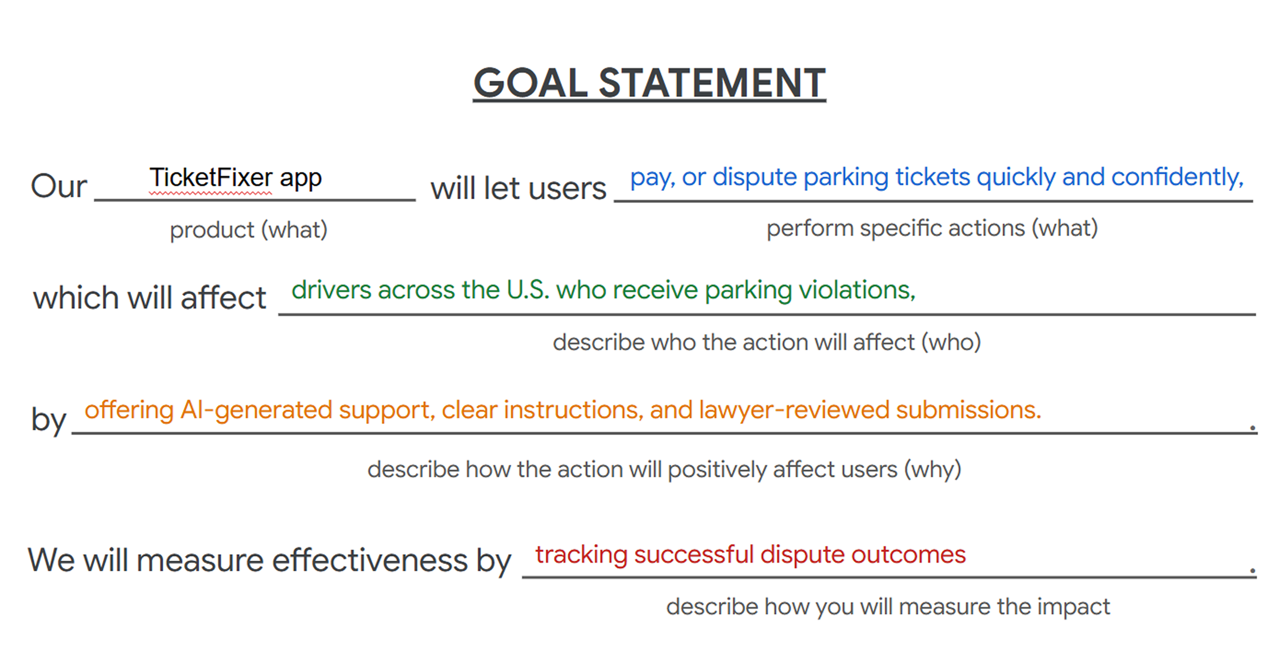
The product
I designed a mobile app and website that help users of all ages find, dispute, and pay parking fines easily
Project duration
4/15/2025 to 6/20/2025
My role
UX Research, UX/UI designer
Responsibilities
Conducting user research, defining personas, mapping user journeys, and creating accessible, intuitive design solutions for the parking fines app and responsive website.
project overview
The problem:
Many users face frustration with outdated city websites, unclear violation details, and complicated processes for disputing or paying fines. This project aimed to deliver a clear, functional, and user-friendly solution that works seamlessly for everyone.
The goal:
The goal of the project was to streamline the process of managing parking fines by providing a user-friendly, functional platform. It aimed to empower users to resolve tickets quickly and confidently, without confusion or stress.

design process

Understanding the user
user research & pain points
I conducted user research through surveys and interviews to understand how people manage parking fines. Initially, I assumed users would primarily prioritize quick payment or disputes, but I discovered that they also valued easy access to fine histories, clear status updates, the ability to manage multiple cars, and the convenience of paying with saved payment methods.


-
Unclear Reasons for Fines or Payments
Malik struggles to understand why he got a ticket and wants a simple way to either dispute it or pay it confidently without second-guessing.
-
Lack of Transparency
He has no easy way to track the status of disputes or view his history of violations and payments in one place.
-
Managing Multiple Vehicles
Since he sometimes drives his girlfriend’s car, he needs to manage fines for several vehicles from one account.
-
Users don’t know what to write in a dispute
Malik struggles to write a proper dispute and needs clear guidance or support to express his case with confidence.
personas

user journey map
Goal: Make paying or disputing parking tickets simple, fast, and stress-free

competitive audit

Gaps
Lack of multilingual or inclusive AI writing support for dispute letters
Few tools offer step-by-step guidance or plain-language explanations of violations
Limited accessibility features (screen readers, font scaling, etc.)
No product combines pay + dispute + history with smart notifications in one flow
Opportunities
Offer AI-powered dispute writing assistant in multiple languages
Design a fully accessible, WCAG-compliant experience
Merge payment, dispute, tracking, and reminders into one intuitive system
Provide contextual education (e.g., “Why this violation?”) in plain language
Support for managing multiple cars
starting the design
paper wireframes
Goals:
Test layout clarity, emphasize key info (amount, due date, status), and support multiple vehicles — all in clean, grayscale wireframes.
Thought Process:
Explored different card styles, filter positions, and bottom nav options to see what feels most intuitive for users managing multiple parking tickets.
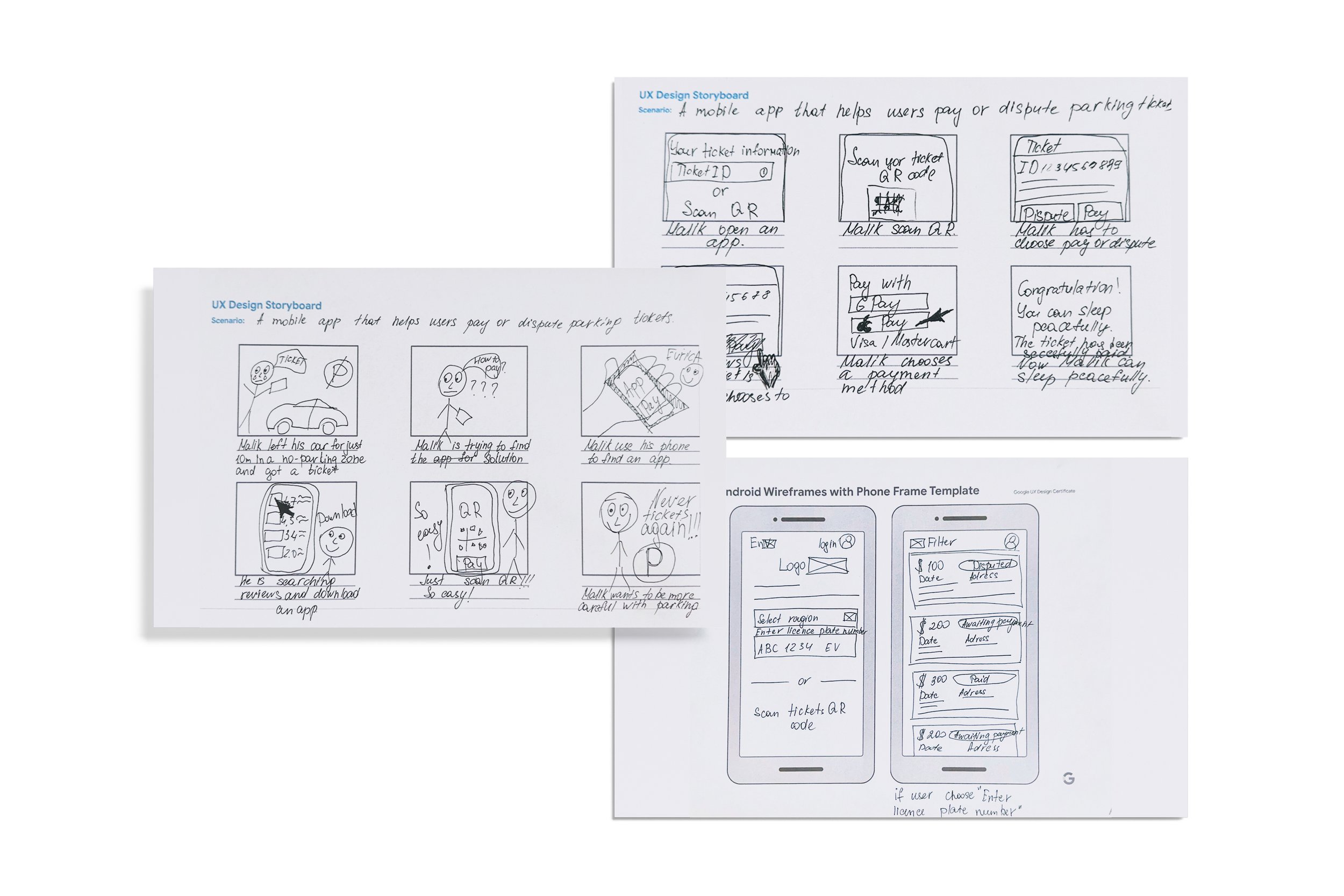
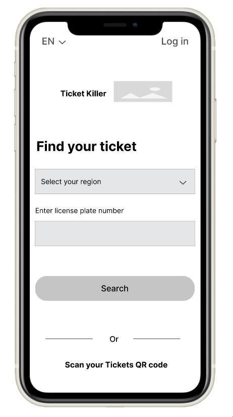
digital wireframes
Explore different layout structures to improve usability and clarity.
Maintain low-fidelity style to focus feedback on layout and functionality, not visuals.

usability study
I'm designing an app that helps users easily find, dispute, or pay parking tickets. I want to learn whether the main tasks—searching for a ticket, understanding the details, and taking action—are simple and intuitive for users to complete.
-
Research Questions
How long does it take for users to find and resolve a parking ticket using the app?
What can we learn from the steps users take to pay a fine or dispute it?
-
Participants
5 participants (3 men, 2 women), ages 34–65
All have received at least one parking ticket in the past 12 months
2 participants manage more than one vehicle
-
Methodology
30 minutes per participant
In-person
Moderated usability study
Users were asked to perform tasks in a low-fidelity Figma prototype
low-fidelity prototype

usability study: findings
AI assistant
Liked AI message, but need to edit it at first
Dispute example
Needed guidance on what to write on dispute; added short text
Photo & doc info
Didn’t know what photo or doc to attach — needed more explanation
Confirmation
Accidentally submitted a dispute without confirmation
Guideline
Users require more clarity on how the service operates, particularly regarding payments and fees.
Dispute explanation
Users are confused about the difference between a regular dispute and using AI assistance.
starting the design
mockups
After usability testing, I added a sample dispute message and helpful tips under “Add Image” and “Add Documents” to reduce confusion and boost user confidence. I also included a simple dispute option and a section explaining the difference between regular and AI-assisted disputes.
After usability testing, I added AI assistant features like “Edit text” and “Regenerate with AI” to give users more control and flexibility when submitting a dispute. This helped reduce confusion and made the experience more user-friendly.


accessibility considerations
-
1
I used the Stark plugin to check and adjust color contrast, ensuring text and UI elements meet accessibility standards.
-
2
I kept the layout clean with large tap targets and readable fonts to support users with visual or motor impairments.
-
3
I added a language selection option so users can interact with the app in their preferred language.
takeaways
Impact:
Participants reported feeling more confident when submitting disputes, thanks to the AI assistant and added guidance. One user said, “This is the first time disputing a ticket didn’t feel overwhelming.”
What I learned:
With every new project, I’ve become less biased in my assumptions and more focused on truly understanding user needs. Using a user-centered design approach has helped me shift from designing based on “what I think looks good” to “what actually works for people.” It’s a mindset I’ll carry into every future design.